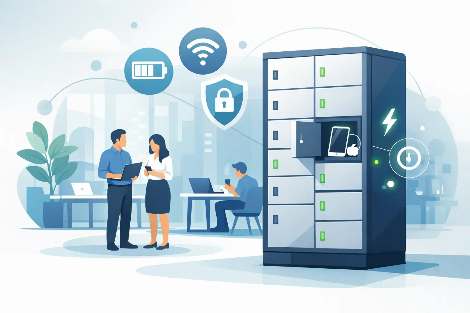
What a Custom Charging Kiosk Wrap Should Do

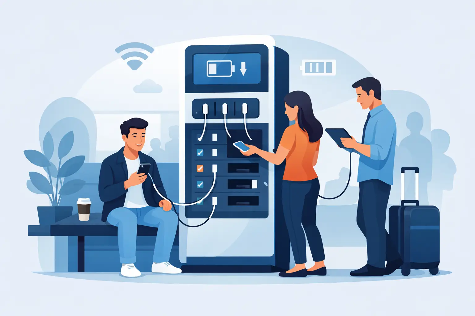
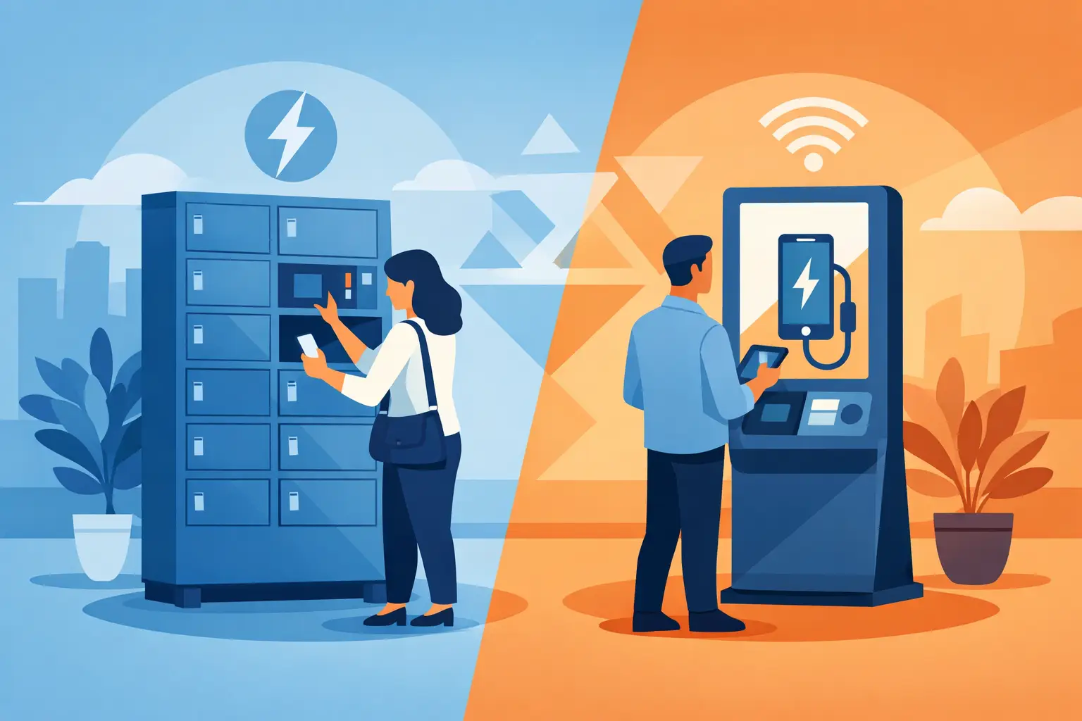
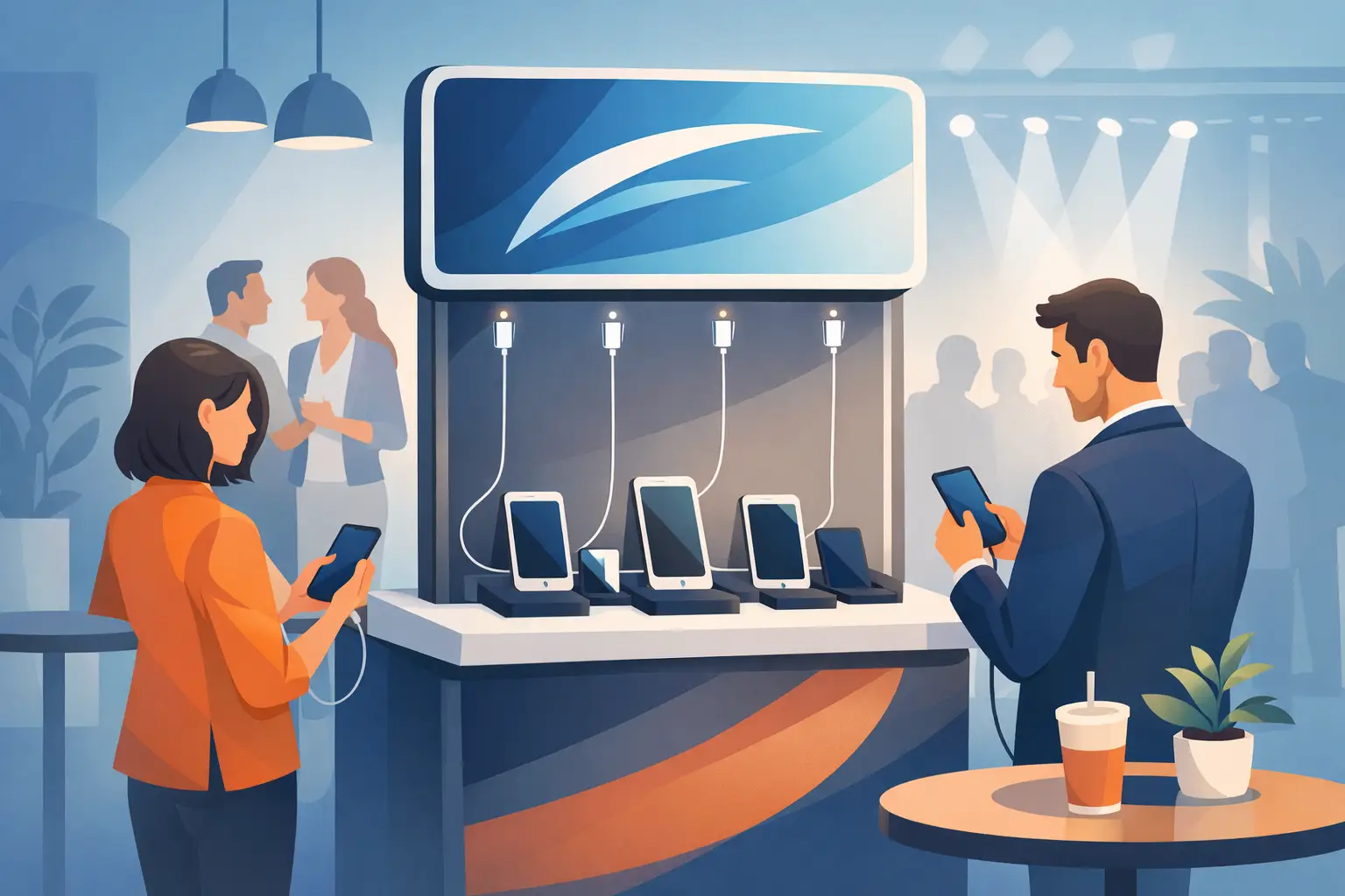
A charging station in a lobby, trade show booth, arena concourse, or retail floor gets noticed for one reason first – someone needs power now. That urgency is exactly why a custom charging kiosk wrap matters. It is not just decoration on hardware. It is the part of the unit that tells people what the station is, who it is for, and why they should trust it enough to stop, charge, and stay.
For business buyers, that changes the conversation. A kiosk wrap is not only a branding add-on. It can improve usage, support sponsorships, reinforce wayfinding, and make the charging asset feel like part of the environment instead of an afterthought. Done well, it helps the unit work harder. Done poorly, it creates confusion, cheapens the space, or gets ignored.
Why a custom charging kiosk wrap affects performance
In physical spaces, people make fast decisions. They glance, interpret, and move on. If your charging kiosk wrap is cluttered, off-brand, or hard to read from a distance, the station may still function perfectly and still underperform.
A strong wrap solves three practical problems at once. First, it identifies the station quickly so visitors understand what it does. Second, it builds confidence by showing that the unit belongs in the space and is maintained by a credible business or organizer. Third, it creates a brand moment at the exact point where people are already engaged and standing still.
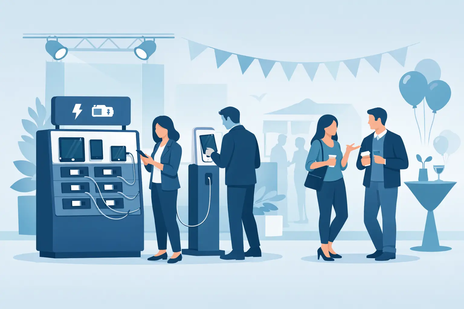
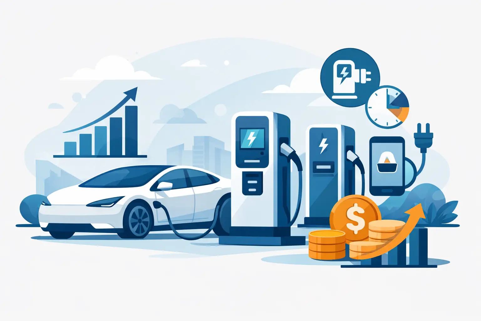
That last point matters more than many buyers expect. Charging stations naturally create dwell time. Whether someone is waiting for a phone to recover at a conference or locking a device while shopping, they are spending focused time near the asset. A wrap turns that moment into branded exposure. In some environments, that can support sponsor value or offset deployment costs.
What the wrap needs to communicate first
The best wraps are not the ones with the most design elements. They are the ones that answer immediate questions without forcing people to think too hard.
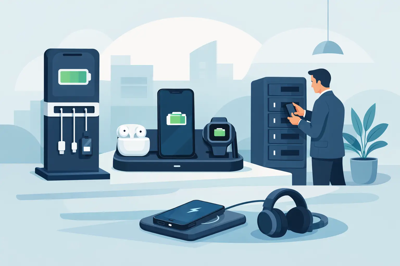
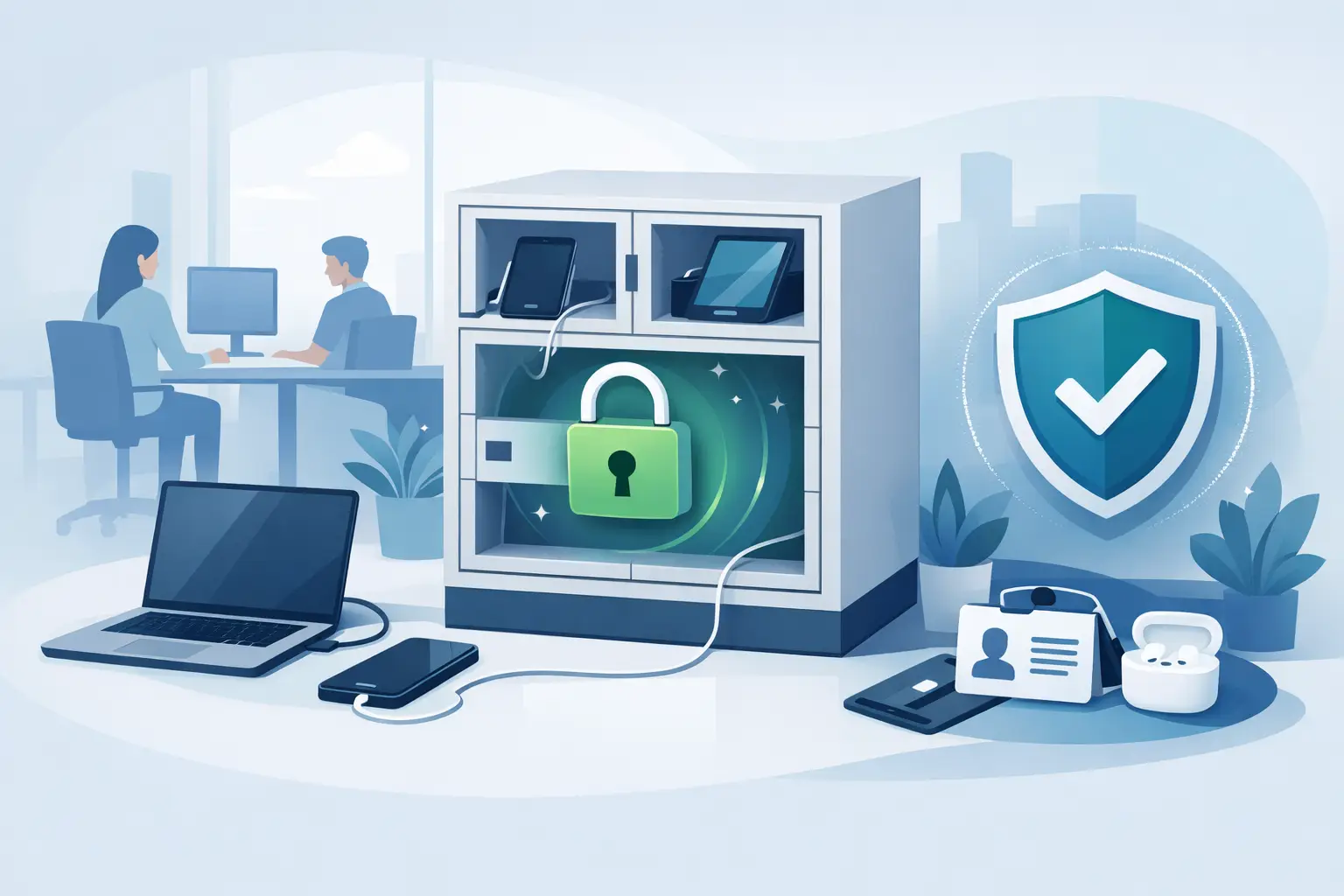
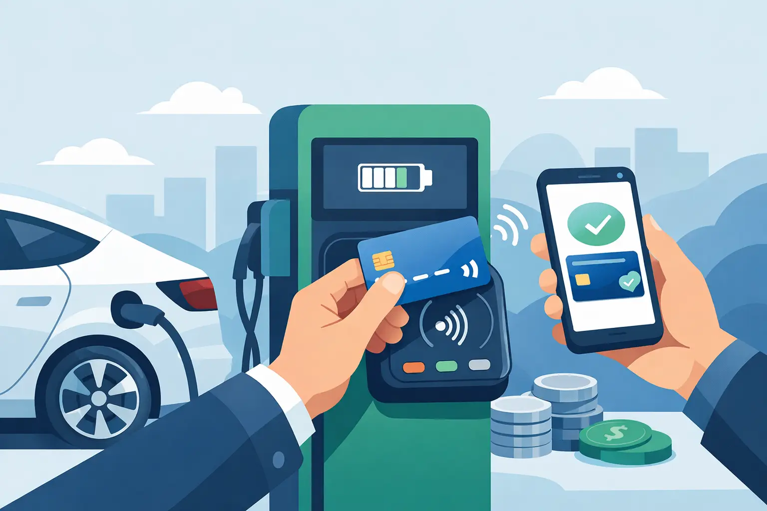
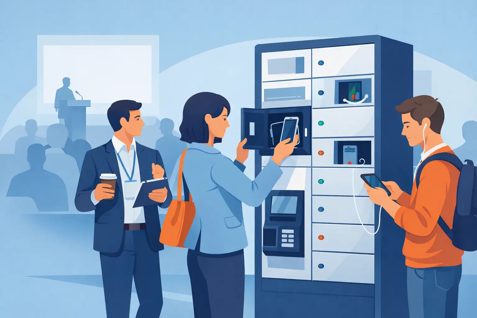
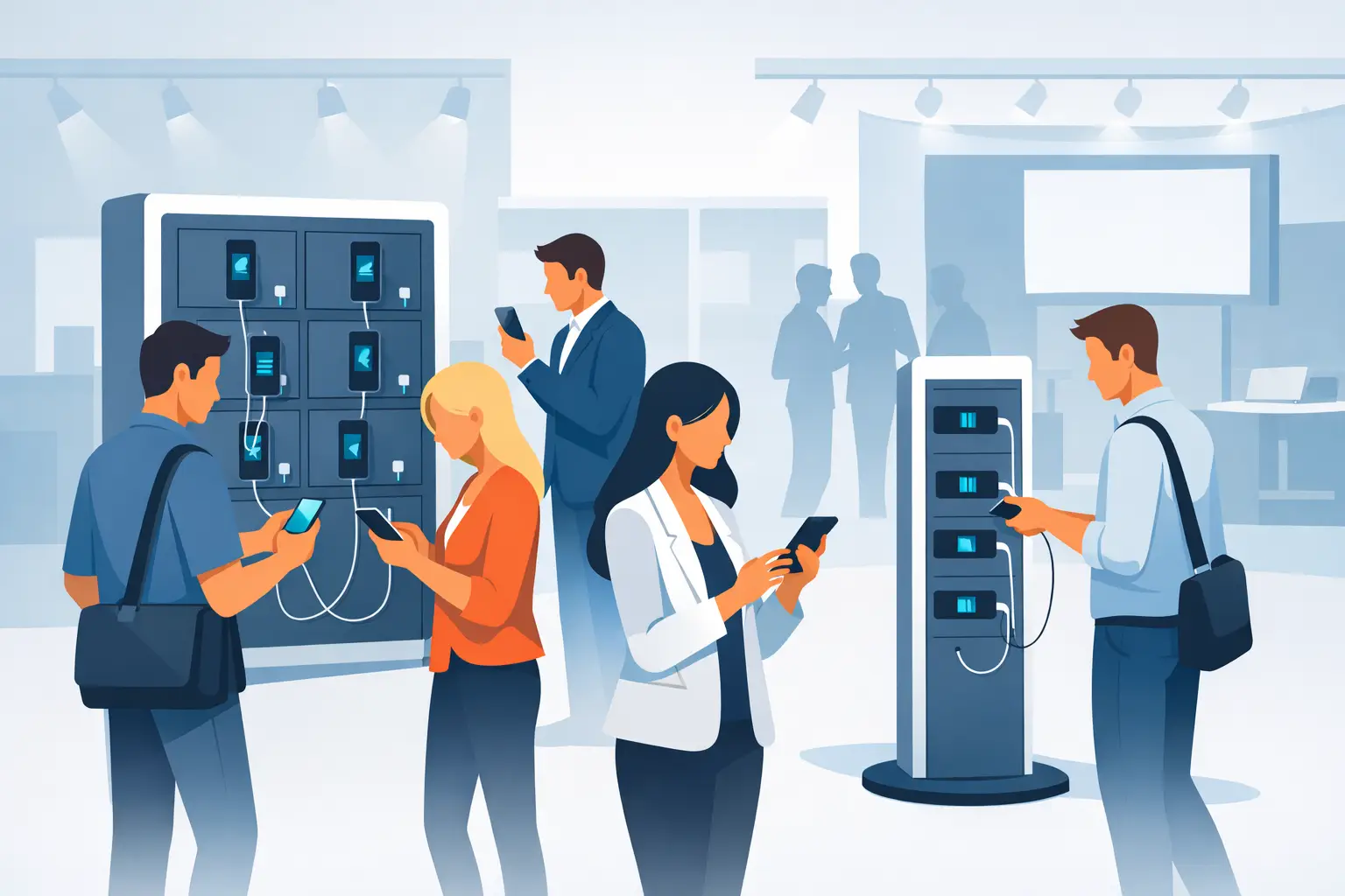
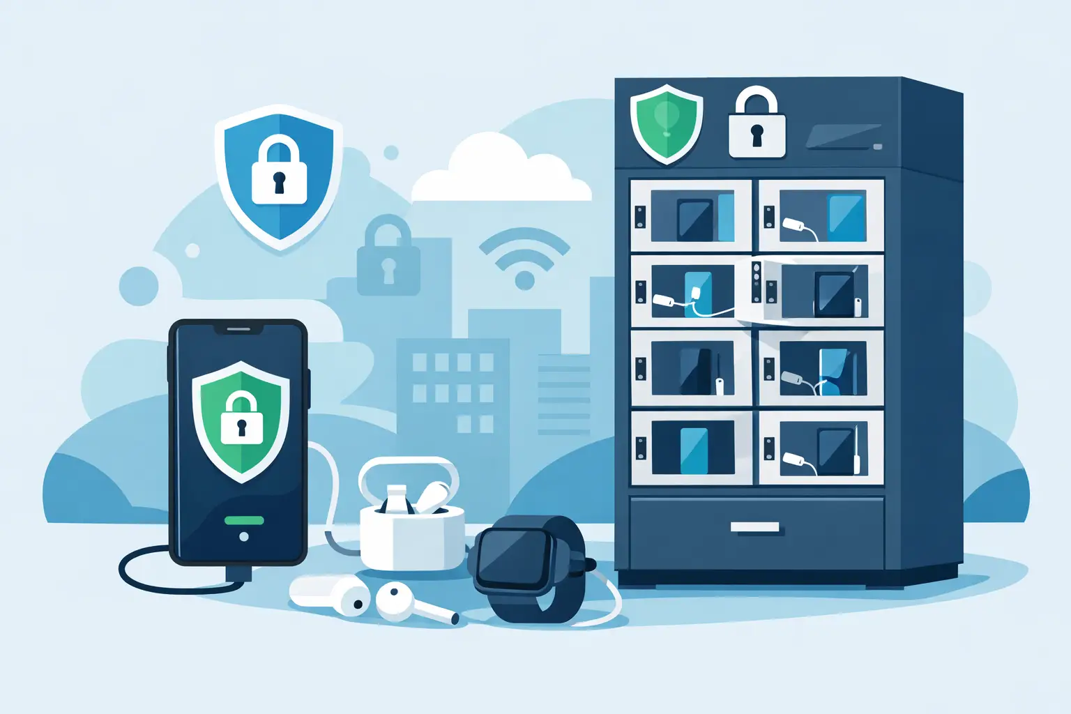
At minimum, people should be able to tell that the unit offers device charging, whether it is free or paid, and how to begin. If the station includes secure lockers, that should be obvious. If it supports phones, tablets, or laptops, that should be clear too. If payment is enabled, the design should help set expectations before the user reaches the screen.
That does not mean covering every inch with copy. In fact, too much messaging usually weakens performance. A custom charging kiosk wrap works best when the hierarchy is obvious. Identify the service. Support trust. Add instructions only where they help. Keep the rest clean.
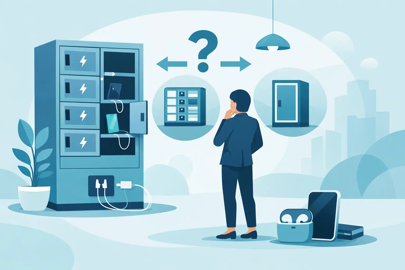
The best design depends on where the kiosk lives
A wrap for a convention center has a different job than a wrap for a corporate office or a hospital waiting area. The environment should guide the design.
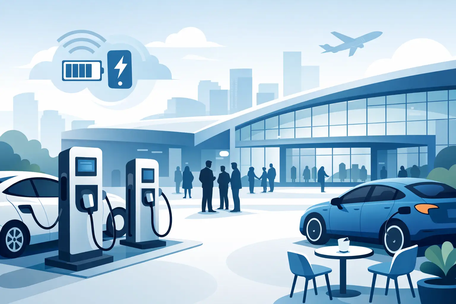
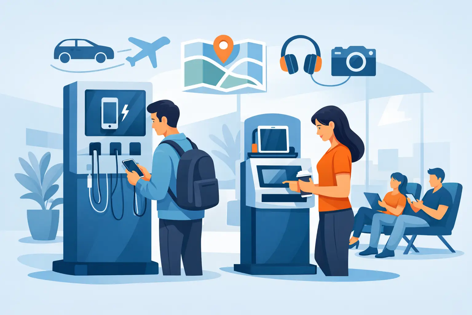
At trade shows and events, visibility usually comes first. These spaces are busy, temporary, and highly competitive. Bold branding, strong contrast, and sponsor integration often make sense because the station is part amenity and part traffic builder. The kiosk can help pull people toward a booth, keep them there longer, and create a useful reason to start conversations.
In retail, the wrap should feel more integrated with the store environment. Loud creative may get attention, but it can also clash with the brand experience. Here, a cleaner design often works better, especially when the goal is to increase dwell time and keep shoppers in-store instead of leaving to find power elsewhere.
In offices, healthcare settings, libraries, campuses, and public venues, trust and clarity usually matter more than visual flash. The station should feel official, easy to use, and appropriate for the space. A design that looks too promotional can reduce adoption in places where visitors want utility first.
Branding is important, but function comes first
This is where many wraps go off track. Internal teams or sponsors naturally want logos, taglines, campaign graphics, QR codes, social handles, and promotional copy. Some of that can work. Not all of it should make the cut.
A charging kiosk is still an operational asset. If the wrap makes ports, screens, locker numbers, instructions, or payment areas harder to find, branding is getting in the way of performance. The station should remain intuitive from several feet away and easy to use up close.
There is also a durability angle. Fine details, tiny text, and low-contrast layouts may look good in a digital mockup and fail in a real venue with glare, foot traffic, and quick glances. Business buyers should evaluate wraps in terms of actual viewing conditions, not just brand standards on a presentation slide.
What to include on a custom charging kiosk wrap
The right content depends on the use case, but most buyers should think in layers.
The first layer is identification. What is this station, and why should someone stop here? The second layer is trust. Is it secure, venue-approved, and easy to use? The third layer is commercial. Does the unit carry a sponsor, premium offer, or branded message that supports revenue or awareness?
In many cases, that means the most effective wrap includes a clear service label, a short benefit statement, and simple visual cues around access or security. Sponsor branding can be valuable, but it should support the user experience rather than crowd it out. If people cannot tell where to start, the ad space is losing money.
Materials and finish matter more than they seem
Buyers often focus on the artwork and overlook the production quality. That is a mistake, especially for installations in high-traffic public spaces.
A kiosk wrap needs to hold up to cleaning, touchpoints, bag strikes, cart bumps, and constant exposure. Matte and gloss finishes each have trade-offs. Gloss can be more eye-catching, but it may create glare under venue lighting. Matte often reads more cleanly and feels more premium, though it may show scuffs differently depending on the material.
The install quality matters too. Poor edge application, bubbling, peeling corners, or misaligned panels make the entire charging asset look neglected. For brands that care about presentation, that can undermine the impression of reliability. For sponsors, it can reduce the value of the placement. A good wrap should look intentional on day one and still look credible months later.
Custom wraps can support revenue, not just branding
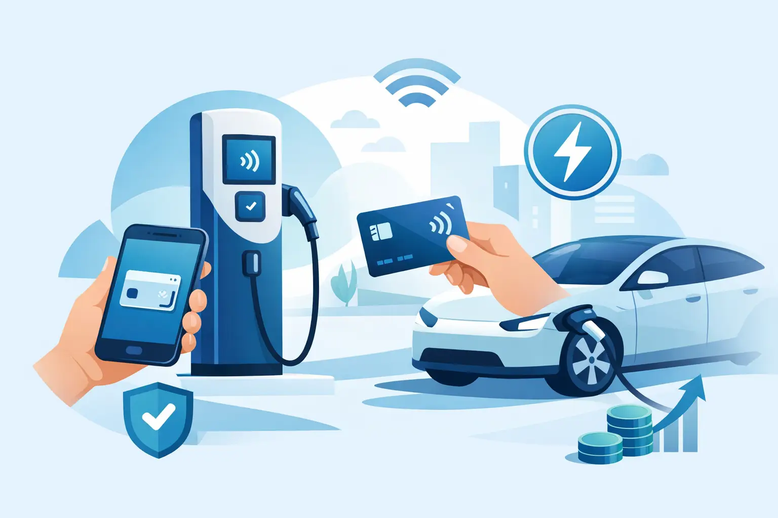
For many organizations, the wrap is part of the business case. If the charging station is placed in a venue, event, or common area with meaningful traffic, the exterior can become sponsor inventory. That is especially relevant when the station already delivers a service people actively seek out.
This is one of the practical advantages of charging infrastructure. Unlike passive signage, it attracts users through need. That creates a stronger opportunity for message recall and sponsor visibility. A custom charging kiosk wrap can help justify premium placement, support event partnerships, or create a sellable asset around a free-use station.
That said, there is a balance. If the design reads like an ad first and a charging solution second, usage may drop. The station should still feel easy, trustworthy, and useful. Revenue works better when the utility remains obvious.
Common mistakes buyers should avoid
The most common issue is trying to make the wrap do too much. When every stakeholder adds one more message, the result is a crowded design that loses clarity.
Another mistake is ignoring the physical form of the unit. Charging lockers, open kiosks, tablet stations, and power bank rental systems all present branding space differently. A design that works on a flat mockup may break across doors, handles, vents, screens, or cable areas. The wrap has to respect how people approach and use the hardware.
There is also the problem of outdated creative. Events end, campaigns change, and seasonal branding expires. If the kiosk will stay in place long term, the artwork should have a longer shelf life unless you plan for regular refreshes. Timeless branding often delivers better value than short-lived campaign art.
How to evaluate a wrap before production
The simplest test is practical. Stand back and ask what a first-time user would understand in three seconds. If the answer is not obvious, the design needs work.
Next, consider the business objective. Is the station meant to increase booth traffic, support a sponsor, improve visitor convenience, or create a polished branded amenity? One wrap may not optimize all four equally. Prioritizing the top goal leads to better decisions.
It also helps to review the design with operations in mind. Can staff clean it easily? Will instructions remain visible during heavy use? Does the design still work if the station is moved to another part of the venue? The most effective customizations are not just attractive. They are usable and durable in the real environment.
For organizations investing in charging infrastructure, the exterior should work as hard as the electronics inside. A well-planned custom charging kiosk wrap gives people confidence, supports your brand, and helps the asset earn its place on the floor. If you treat it like a performance tool instead of a decorative layer, it tends to deliver more than impressions.
Related posts

Phone Charging Lockers for Gyms That Members Use
Jul 26, 2026
Phone charging lockers for gyms keep members powered, valuables secure, and workouts on track while creating a valuable amenity or revenue opportunity.
Best Charging Lockers for Offices in 2026
Jul 23, 2026
Find the best charging lockers for offices with secure storage, USB-C support, smart access, and the right capacity for staff, guests, and shared devices.
Phone Charging Stations That Work Harder
Jul 21, 2026
Phone charging stations keep guests engaged, staff productive, and events moving. Learn how to choose secure, scalable options that can earn revenue too.

How to Deploy Charging Amenities That Pay Off
Jul 19, 2026
Learn how to deploy charging amenities that keep visitors powered, increase dwell time, support operations, and create revenue in any venue with clarity.
Secure Charging for Employee Devices at Work
Jul 18, 2026
Secure charging for employee devices keeps work moving while protecting phones, tablets, and laptops. Learn what a practical workplace setup needs today.

Venue Device Charging Solutions That Pay Off
Jul 16, 2026
Venue device charging solutions keep guests connected, increase dwell time, protect devices, and can create new revenue at events and public spaces daily.
Can Charging Kiosks Take Payments? Yes, Here’s How
Jul 14, 2026
Can charging kiosks take payments? See how POS-enabled charging turns low-battery demand into convenience, longer visits, and new venue revenue streams.

Custom Branded Charging Stations That Earn Attention
Jul 11, 2026
Custom branded charging stations turn low-battery stress into longer visits, stronger brand visibility, and a practical revenue opportunity for venues.
Charging Kiosks That People Actually Use
Jul 10, 2026
Charging kiosks keep guests powered, on-site, and engaged. Learn how to choose the right setup for security, revenue, and everyday use.
Charging Stations for Convention Centers
Jul 08, 2026
Charging stations for convention centers reduce attendee stress, boost dwell time, support sponsors, and create new revenue opportunities.

How to Lease Charging Kiosks Smartly
Jul 06, 2026
Learn how to lease charging kiosks with the right terms, pricing, features, and support so your venue adds convenience and potential revenue.
Visitor Amenity Charging Kiosk: What to Buy
Jul 04, 2026
A visitor amenity charging kiosk helps venues keep guests powered, engaged, and on-site while supporting security, branding, and revenue goals.

Business Charging Station Buying Guide
Jul 02, 2026
Business charging station buying guide for choosing secure, scalable charging solutions that improve guest experience and create revenue.
Contactless Payment Charging Station Benefits
Jun 30, 2026
A contactless payment charging station helps venues boost convenience, capture revenue, and keep guests engaged without adding operational friction.
How to Choose Charging Lockers for Your Space
Jun 28, 2026
Learn how to choose charging lockers for events, venues, offices, and retail spaces based on security, device mix, power needs, and ROI.
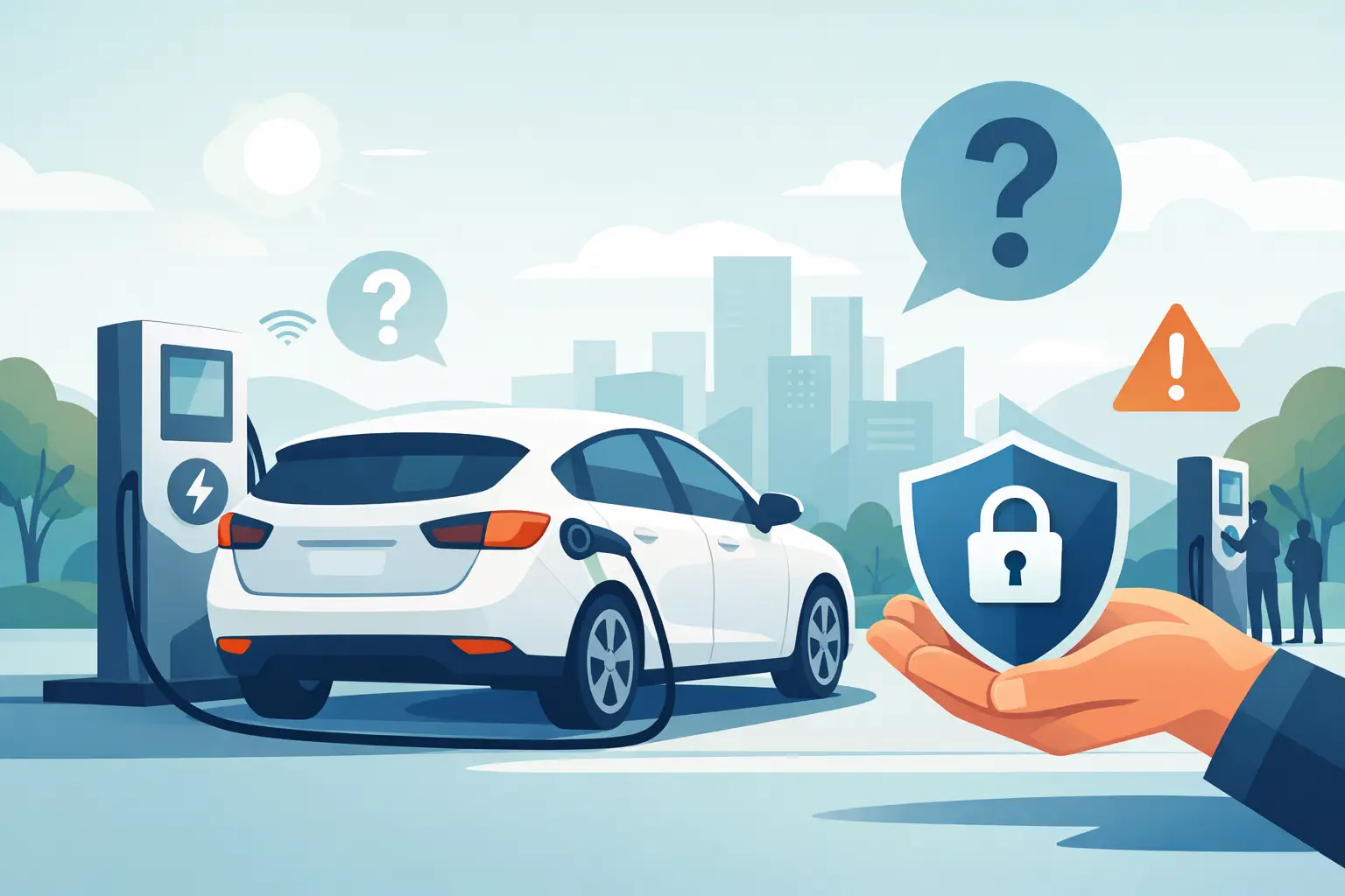
Are Public Charging Stations Safe to Use?
Jun 26, 2026
Are public charging stations safe to use? Learn the real risks, how secure charging stations work, and what businesses should provide.
Best Desktop Charging Station for Office Use
Jun 24, 2026
Find the right desktop charging station for office use with tips on safety, device mix, cable management, security, and long-term value.
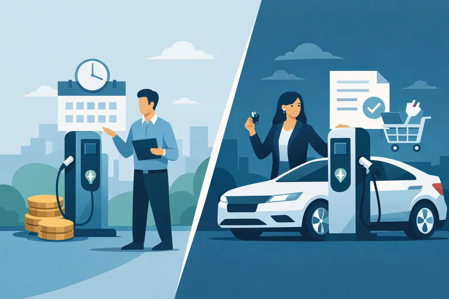
Leasing vs Buying Charging Stations
Jun 22, 2026
Leasing vs buying charging stations comes down to budget, flexibility, and ROI. Learn which model fits events, venues, offices, and retail.
Charging Lockers vs Kiosks: What Fits Best?
Jun 20, 2026
Charging lockers vs kiosks: compare security, throughput, revenue, and fit by venue so you can choose the right charging setup for your space.

Charging Locker ROI Calculator Guide
Jun 17, 2026
Use a charging locker ROI calculator to estimate payback, revenue, and visitor impact. Learn which costs, assumptions, and metrics matter most.

How to Monetize Charging Kiosks
Jun 16, 2026
Learn how to monetize charging kiosks with the right pricing, placement, sponsorships, and formats to turn charging access into revenue.
What Is Juice Jacking Protection?
Jun 13, 2026
What is juice jacking protection? Learn how it blocks data theft through USB ports and why businesses should offer safer public charging access.
USB C Charging Trends Businesses Should Track
Jun 12, 2026
USB C charging trends are reshaping public, workplace, and event charging. See what matters for compatibility, speed, safety, and ROI.
USB C Charging Station Commercial Guide
Jun 09, 2026
A practical look at usb c charging station commercial options, including use cases, power, security, placement, pricing, and ROI for busy venues.

Charging Table for Waiting Room Buyers
Jun 08, 2026
A charging table for waiting room spaces keeps guests powered, improves dwell time, and adds convenience without adding operational friction.
What a Custom Charging Kiosk Wrap Should Do
Jun 07, 2026
A custom charging kiosk wrap should attract attention, fit the venue, and support ROI. Learn what to include and what to avoid.
Branded Charging Station for Events That Works
Jun 06, 2026
A branded charging station for events keeps guests powered, boosts dwell time, supports sponsors, and adds measurable value to the event floor.
Conference Charging Locker Rental That Works
Jun 05, 2026
Conference charging locker rental keeps attendees powered, secure, and engaged while creating smoother events, stronger sponsor value, and revenue.
Trade Show Phone Charging Station Guide
Jun 04, 2026
A trade show phone charging station can boost booth traffic, dwell time, and leads while reducing attendee battery stress and improving event ROI.
Event Charging Station Rental That Works
Jun 03, 2026
Event charging station rental keeps guests powered, engaged, and on site longer. Learn what to rent, what to ask, and how to avoid event-day issues.

Free Phone Charging Station Retail ROI
Jun 02, 2026
See how free phone charging station retail setups increase dwell time, improve customer experience, and support smarter in-store traffic flow.

Charging Kiosk With Payment System: Worth It?
Jun 01, 2026
A charging kiosk with payment system can add revenue, improve guest experience, and extend dwell time. Here's how to choose the right setup.
Pay Per Use Charging Station ROI Explained
May 31, 2026
Learn how a pay per use charging station creates revenue, improves visitor experience, and fits retail, events, offices, and public venues.
Power Bank Rental Station Buyer’s Guide
May 30, 2026
A power bank rental station helps venues keep guests charged, boost dwell time, and create revenue with flexible, low-friction charging access.

Choosing a Laptop Charging Locker Cabinet
May 29, 2026
Learn how to choose a laptop charging locker cabinet for offices, schools, events, and venues with the right mix of security, power, and ROI.

Tablet Charging Locker for Schools: What Matters
May 28, 2026
A tablet charging locker for schools improves device security, charging access, and classroom readiness. Here’s what buyers should evaluate.
Secure Phone Charging Locker Buying Guide
May 27, 2026
Choose a secure phone charging locker that protects devices, improves guest experience, and fits your space, budget, and usage model.

Phone Charging Station for Business ROI
May 26, 2026
A phone charging station for business can boost dwell time, improve customer experience, and create revenue when matched to the right space.

How to make your phone battery last longer
Mar 20, 2025
It’s no secret that some smartphones have more powerful and longer lasting batteries than others. However, no matter how powerful the battery or how energy efficient your phone is, there are a number of apps and settings that will drain your battery faster. Identifying these apps and settings will help you keep usage to a […]

Phone Batteries – The Best and The Worst
Mar 29, 2017
When buying a new smartphone, there are a number of factors you will consider. From the brand and price, to the operating system, and other features like the camera. No matter what kind of phone you choose or the reason behind your purchase, one thing is for sure – you want the battery to last […]
What is USB-C and why is it important?
Mar 15, 2017
By now, you may have heard people talking about USB type C or perhaps you have even tried it out yourself. Either way, many experts agree that this is the future of USB ports and cables. What many people may not realize is that this particular type of connection is significantly different from older types […]